Client: Karyn
Location: Jakarta, Indonesia
Year: 2024
Location: Jakarta, Indonesia
Year: 2024
Karyn was formerly known as Carina, a women’s clothing brand specialising in sets and dresses for those with little time to dress up.
The Problem
They were ready to scale and compete in the premium market but lacked the right look and feel.
They were ready to scale and compete in the premium market but lacked the right look and feel.
The aesthetics weren’t bad, but the logo wasn’t effective as a profile picture. The text inside the symbol was too small to read in smaller applications, and the composition made the “C” easily mistaken for an “O.”
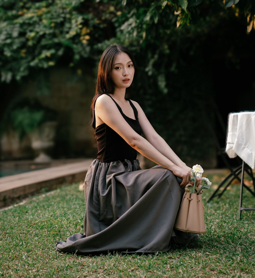
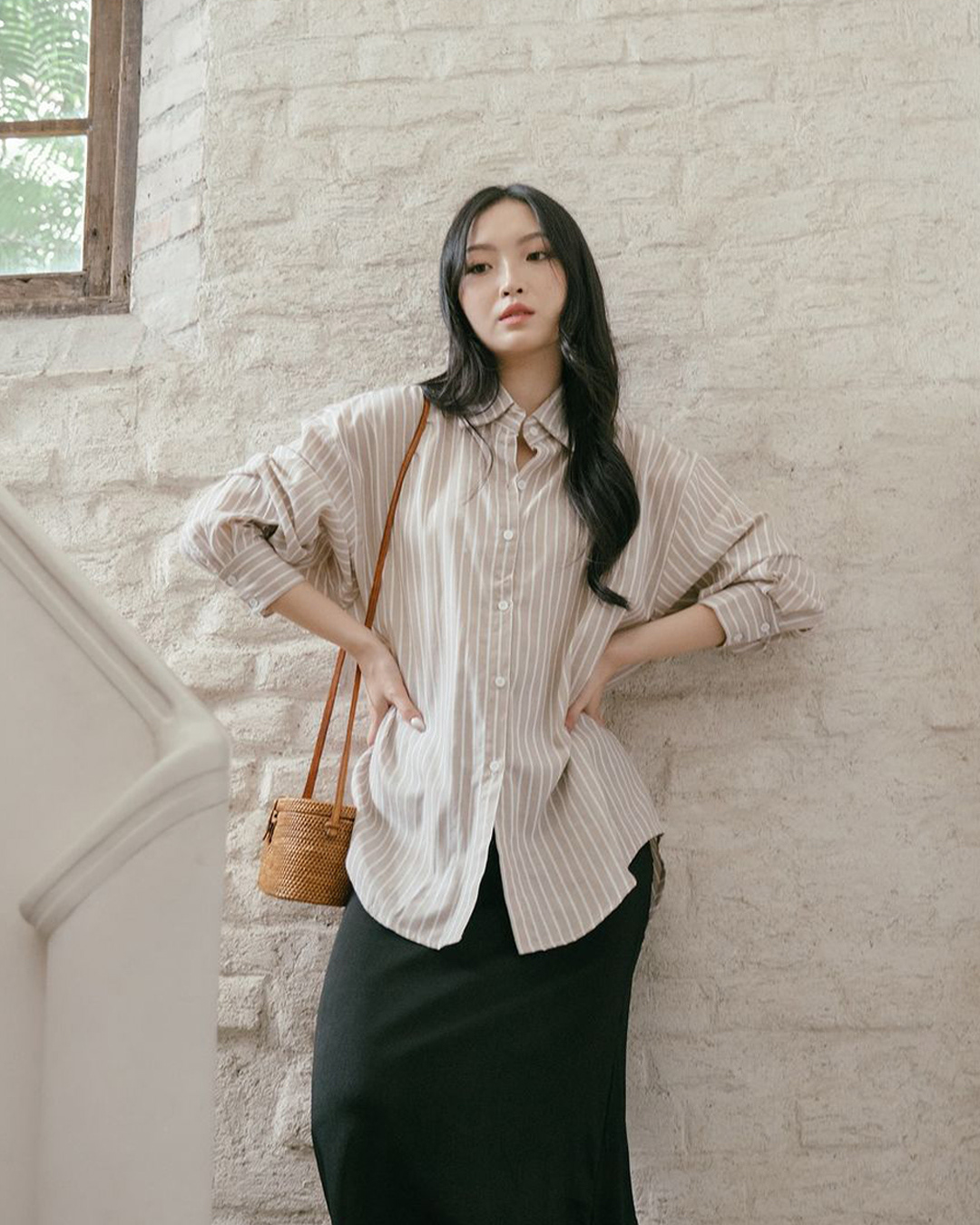
The brand’s photos also didn’t feel premium; they looked homemade. To compete, they not only needed a high-end look and feel like these brands below but also a distinct identity that set them apart.
Initially, they targeted 18–43-year-old women. However, data revealed their real buyers were 28–43, mostly married, while the single ones were career women. Their original messaging—emphasising convenience—was logical but lacked emotional resonance.
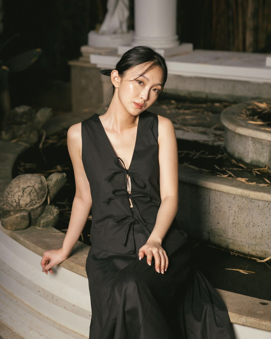
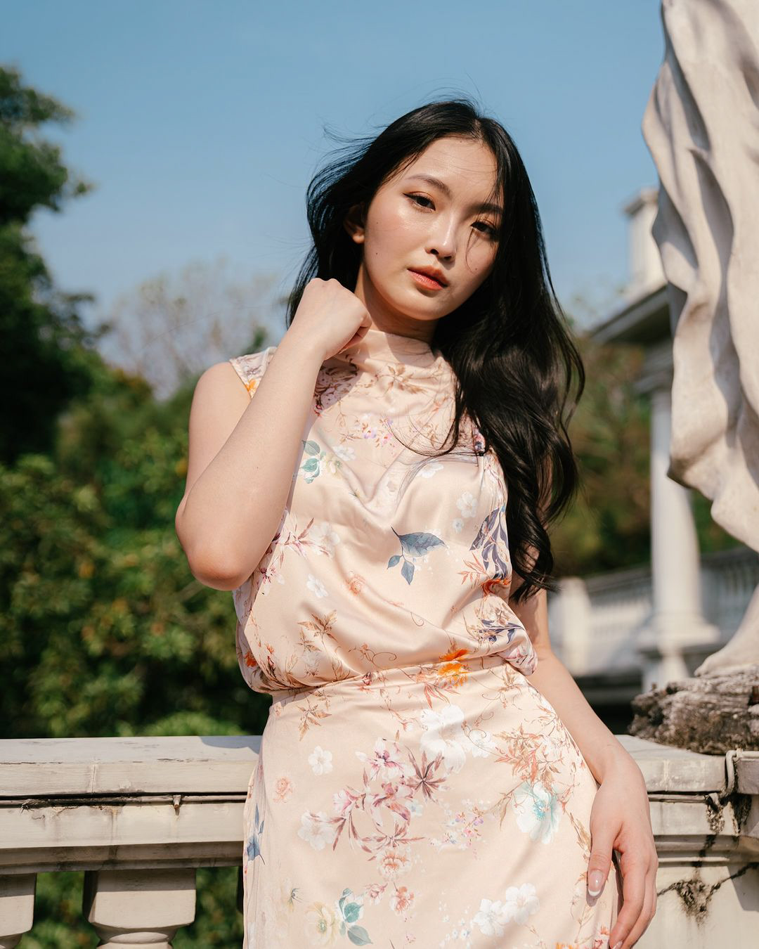
Understanding the need for change, the owners hired a model and conducted a photoshoot, giving me a glimpse into their envisioned future. All they needed was a bridge to achieve it.
The New Narrative
The dresses and sets were pretty—not loud, but subtle and timeless. They exuded purity and an innocent, rejuvenating look. This is perfect for the audience because they want to preserve what they have, if not improve it.
The dresses and sets were pretty—not loud, but subtle and timeless. They exuded purity and an innocent, rejuvenating look. This is perfect for the audience because they want to preserve what they have, if not improve it.
Fashion trends? Those are for teenage and college girls. Karyn’s audience has grown past that. They’re building careers, raising families, and carving out their own identities.
Using a mix of the Innocent and Caregiver archetypes, we changed the name to Karyn—derived from the Greek word for “pure.” The brand now spoke directly to them: We are grown-ups now, and Karyn is here to support you. You are already beautiful; all you need are a few sets and dresses to complement that beauty.
It's your style, your story.
Crafting the New Identity.
With this new narrative, I created a mood board. The theme? Spring—a season of renewal, growth, and new beginnings. The brand wouldn’t shout. It would whisper.
With this new narrative, I created a mood board. The theme? Spring—a season of renewal, growth, and new beginnings. The brand wouldn’t shout. It would whisper.
Keywords:
Pure, innocent, feminine, subtle.
Pure, innocent, feminine, subtle.
Choosing the Typography.
The typeface had to be elegant—not girly, but refined. It needed to feel premium.
The typeface had to be elegant—not girly, but refined. It needed to feel premium.
That’s when I found Amandine on Adobe Fonts. A high-contrast, rational sans-serif, it carried the elegance and exclusivity we needed. Perfect for the wordmark.
But Amandine alone was not enough. It's great as a wordmark. But it's only available on Adobe Fonts. Its legibility also suffers when we use it as a headline.
So, we prepared a secondary typeface, Elsie. It's available on Google Fonts and accessible for everyone. For the body text, we chose Noto Sans. This dynamic sans-serif complements the two rational serifs.
Finding the Right Symbol
The logo needed to reinforce the brand’s essence. At first, we considered flowers, but they were too common.
The logo needed to reinforce the brand’s essence. At first, we considered flowers, but they were too common.
We explored the nature but avoided anything with religious associations (sheep, dove, Easter bunny) or a hunting connotation (deer).
Then, we found the perfect fit: a butterfly—pure, innocent, feminine, and quiet. It also symbolises transformation.
But how do we design it?
The first iterations were too geometric. It looked decent but lacked personality. It needed to feel exclusive—something the client could truly own. A symbol for them and them only.
So, what about using the K?
I mirrored the letter to build the symbol’s structure, removed one stem, and moved the other to the centre. The butterfly’s wings came from glyphs in the font family. Together with the wordmark, they formed an elegant, cohesive identity.
The result is a logo that embodies the brand’s essence, resonates with the audience, and couldn’t be swapped out for anything else because it's tailored specifically for the brand and its customers.
Let's see how it works.
The Outcome
The identity was well-received. Karyn now has a refined, premium presence—one that not only fits the market but stands apart.
The identity was well-received. Karyn now has a refined, premium presence—one that not only fits the market but stands apart.
With a story-driven approach, we didn’t just design a visual system; we gave Karyn a voice.

