Client: Eka Optical
Location: Pekanbaru, Indonesia
Year: 2020
Location: Pekanbaru, Indonesia
Year: 2020
Eka Optical is an optic shop that operates in Pekanbaru, Indonesia. Their service involves vision screening, lens and contact lens fitting, myopia management, eyewear styling, and more.
They needed an identity design to stand out in the streets so customers could locate them. They also wanted to move away from the image of being an old-school family-run business to keep up with the times.
One thing we noticed during the discovery session is that the store and its people pride themselves on their hands-on service, saying people can't get this elsewhere as the lens manufacturing is hand-made and made differently for each customer.
That feeling is something we can incorporate into the shape of the logo.
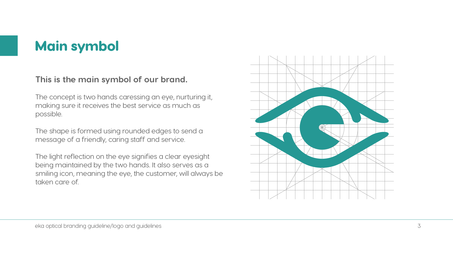
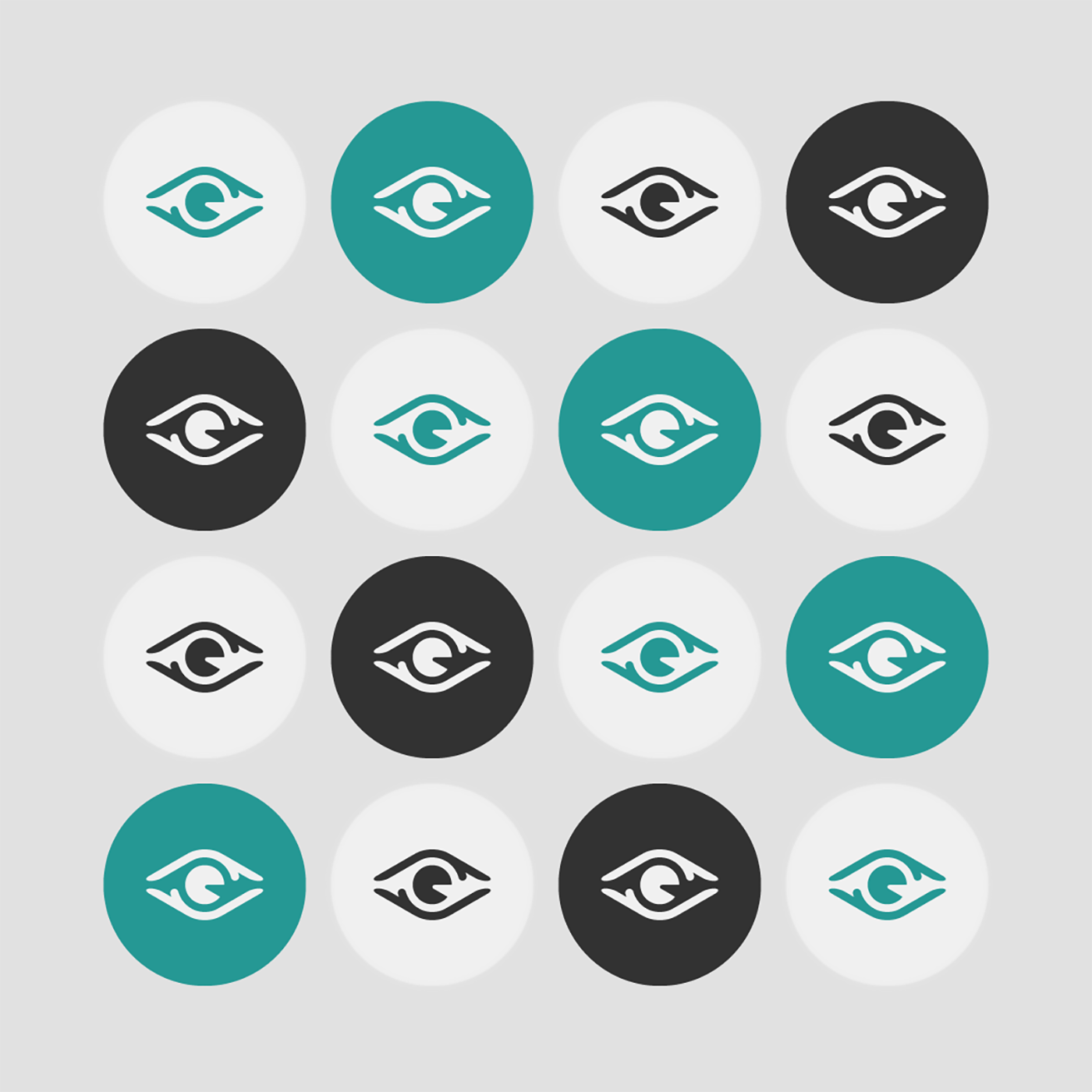
So here's the logo concept, two hands caressing an eye, nurturing it, making sure it receives the best care and service.
The shape is formed using rounded edges to send a message of friendly, caring staff and service.
The light reflection on the eye signifies a clear eyesight maintained by the two hands.
The "e" also serves as a smiling icon, meaning the eye, the customer, will always be taken care of.


Visit my Contact page for inquiries.


